The editor: Design
Lays out what a report email actually looks like: a grid canvas you place Qlik charts, tables, text, and images onto.
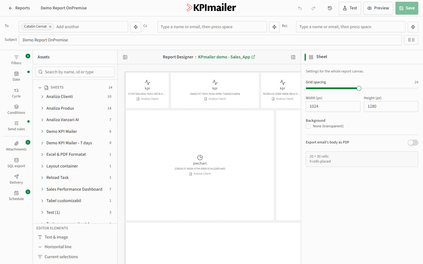
The canvas
Section titled “The canvas”The Design canvas is the center of the editor. The Assets panel on the left lists every sheet and Qlik object in the connected app, plus editor elements that aren’t pulled from Qlik.
- Sheets in the Assets panel mirror the Qlik app’s own sheets, each listing its objects (charts, tables, KPIs) with a count badge.
- Editor elements - Text & image, Horizontal line, and Current selections - aren’t Qlik objects; they let you add static content or show which selections were applied when the report ran.
- Search the Assets panel by name, id, or type to find a specific object in a large app quickly.
To add something to the report, drag an object or element from the Assets panel onto the canvas. Cells snap to the grid; drag their edges to resize, or drag the cell itself to reposition it.
Cell properties
Section titled “Cell properties”Select any cell to open its properties on the right. For a Qlik object, you can set:
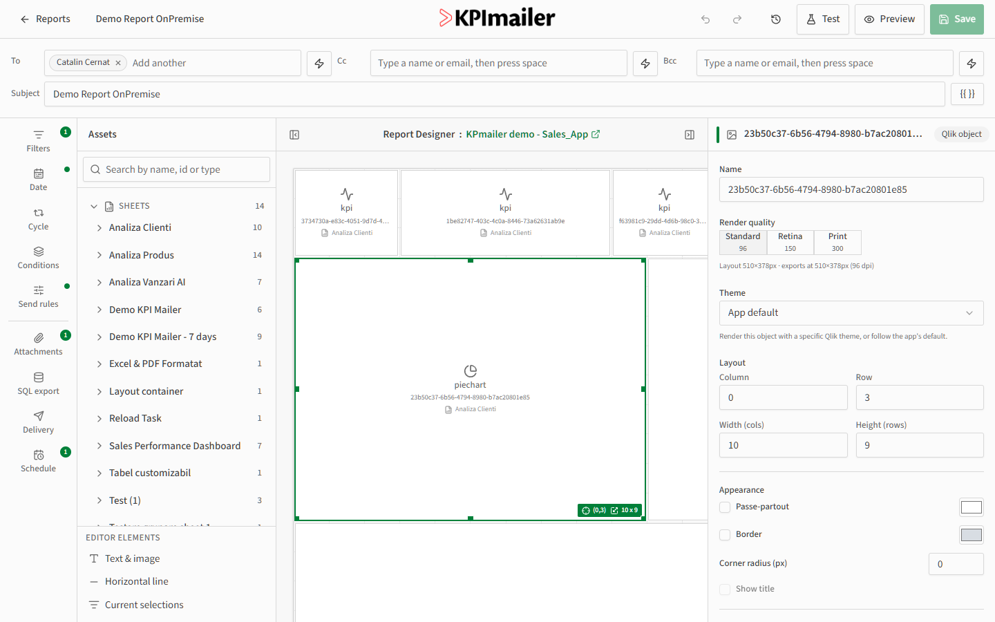
- Render quality - Standard (96 dpi), Retina (150 dpi), or Print (300 dpi). Higher quality looks sharper but takes longer to render and produces a larger email.
- Theme - render the object with a specific Qlik theme, or follow the app’s default.
- Layout - the cell’s column, row, width, and height on the grid, editable here or by dragging on the canvas.
- Appearance - a passe-partout (background) color, an optional border and corner radius, and whether to show the object’s title.
Sheet settings
Section titled “Sheet settings”Select an empty part of the canvas (or close a cell’s properties) to see settings for the whole sheet: grid spacing, canvas width and height in pixels, a background color, and whether to also export the email’s body as a PDF.
Worked example
Section titled “Worked example”To build a simple sales summary, drag three KPI objects from the Demo KPI Mailer sheet onto the top of the canvas, then drag a pie chart from Analiza Clienti below them. Click the pie chart, set its Render quality to Retina for a sharper image in email, and drag its corner to widen it to fill the row. The layout updates live as you work.
Continue to Sections & conditional rendering to show or hide parts of the layout based on the data.